Ten Book Cover Trends (that you like or dislike)
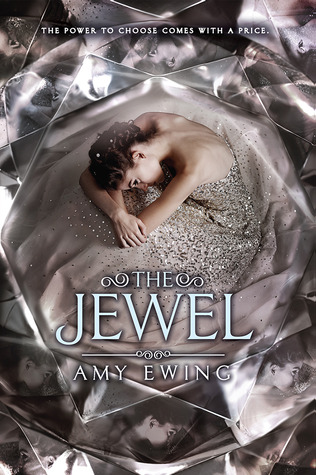
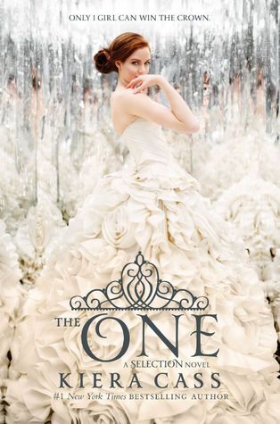
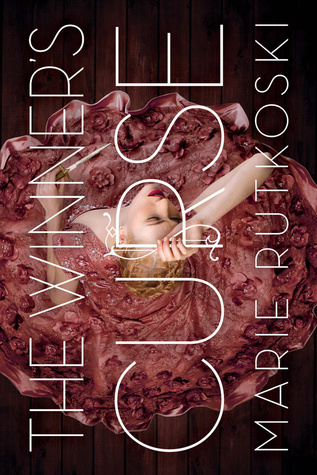
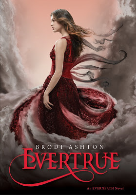
1. The Pretty Dress (Like)- This trend isn't as widespread as it was a couple years ago (when almost everything had a dress in it) but it's still very popular.
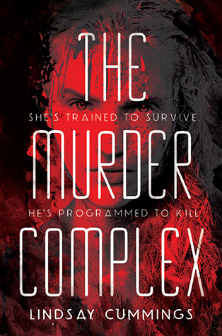
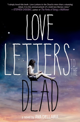
2. BIG COVER FILLING FONT- (Like) It's pretty and I definitely know what the book is called.
3. Smoke on the bottom- (ehh I'm not sure if I do like this one) When done right it looks nice otherwise it looks kind of cheesy.
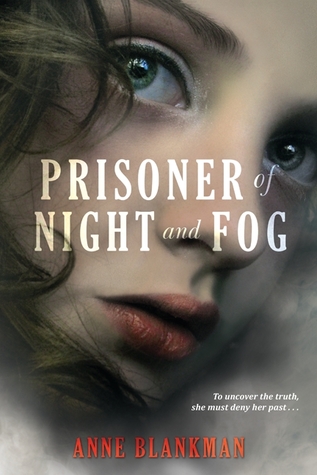
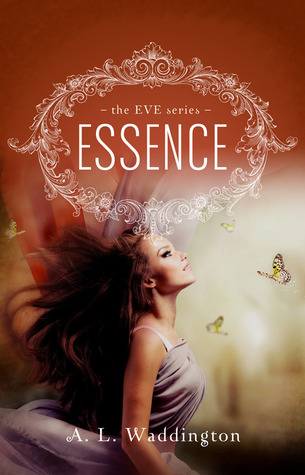
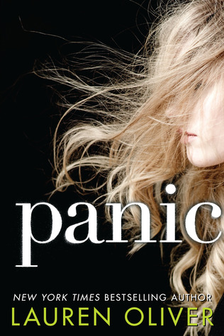
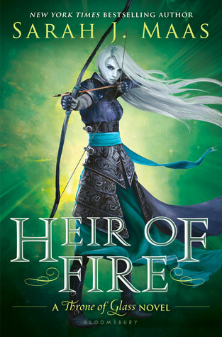
4. Flowing Locks of Luscious Hair~ (ok, I'm going to go with like on this one too)
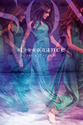
5. The Side-Pose (ehhh) It's very model-esque- You guys be the judge!
So I could only come up with five different cover trends that I noticed. Do you guys have any more that you want to share? What you do you think about the ones that I posted? Leave your comments below so I can see what you guys think!

*Covers pictured above are:
1. The Jewel by Amy Ewing : The One by Kiera Cass : The Winner's Curse by Marie Rutkoski
2. Everything Leads to You by Nina Lacour : The Murder Complex by Lindsay Cummings : Love Letters to the Dead by Ava Dellaira
3. Dissonance by Erica O'Rourke : Prisoner of Night and Fog by Anne Blankman : Evertrue by Brodi Ashton
4. Essence by A.L. Waddington : Panic by Lauren Oliver : Heir of Fire by Sarah J. Mass
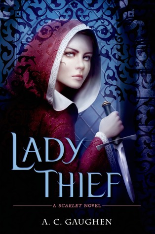
5. Lady Thief by A.C. Gaughen : Strange and Ever After by Susan Dennard : Tsarina by J. Nelle Patrick


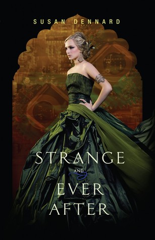
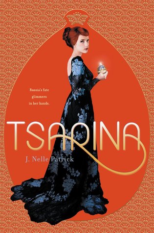
I'm a fan of dresses and titles that fill the whole page as well.
ReplyDeleteNicole @ Feed Your Fiction Addiction
Flowing Locks of Luscious Hair are my favs! So inviting :)
ReplyDelete